Fishy tales poster

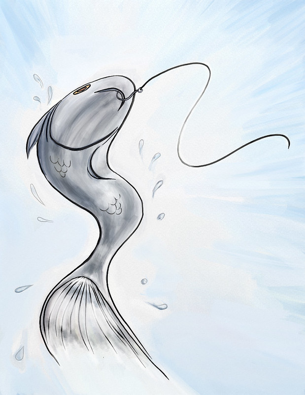
The illustration.

Fishy Tales illustration

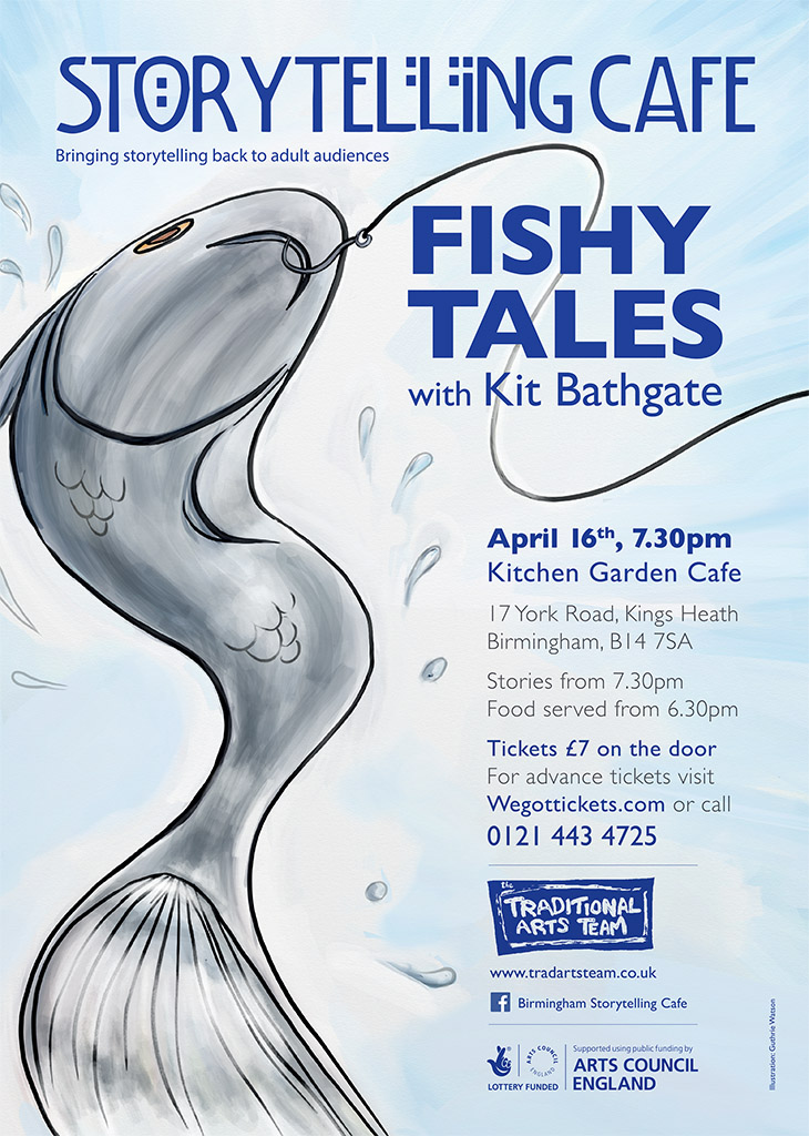
The finished poster design.

Fishy tales poster design

This fishy illustration was created for the Birmingham Storytelling Cafe’s Fishy Tales event happening in April.

With this illustration I’ve tried to convey the notion of struggle and the sea, as well as give the piece a sense of movement and energy. The dynamic pose is designed to reinforce the idea of drama that will be part of the evenings stories.

If you’re in Birmingham you might want to go along. Advance tickets can be brought from Wegottickets.com.

http://www.wegottickets.com/event/260548

Open studio and new work

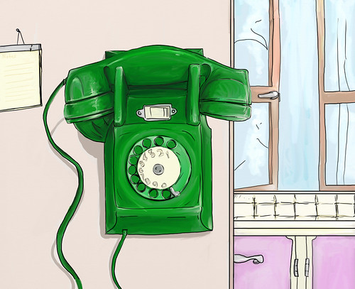
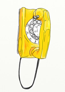
Green wall phone

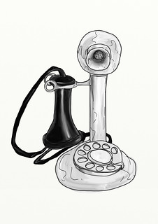
Candle stick phone  Yellow wall phone

Last weekend was Bow Arts Open Studio event, I’ve a studio at the back of Bow Road studios.

I had very positive feedback from the, roughly, 150 people who came through my studio, as well as selling prints and cards straight off the event.

As a result I’m going to be offering some these for sale through this site.

Above are some of the new work that was on show. I’ve been creating nostalgic renderings of old rotary dial phones this year. These solid old phones were always far more satisfying to hang up with after a heated conversation than modern touch screens.

I used the newest edition of ArtRage and a little bit of Photoshop (CC) in creating these images as well as my trusty sketch book. I’m currently loving the Oil brushes in ArtRage and Photoshops updated liquify filters to push line work around with.

Thanks is owed to the Bow Arts staff and volunteers as well as fellow artists for making the event a good one.

Bow Arts Open Studio

Bow Arts Open Studio 2013

So it’s another year and another Bow Arts Open Studio. This year the private view is on Saturday 29th of June at 6pm with a more general open day on Sunday.

I am planning an informal arrangement for my studio with works in progress, some new prints and a small selection of cards for sale.

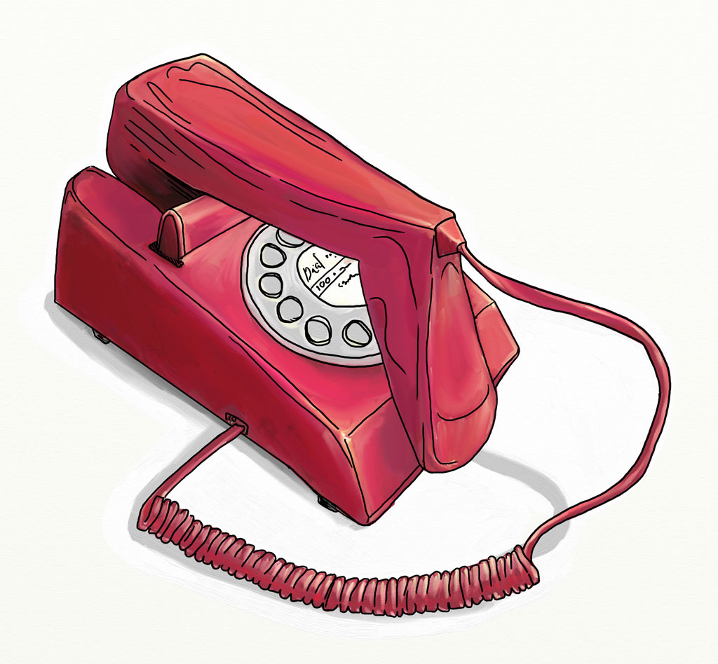
Here’s a sample of a series of old school phones I’ve been working on. They make a bright colourful series and I think will look good as cards.

70s pink telephone

70s pink telephone, digital painting (2013)


Hope to see you there.

Saucy goodness

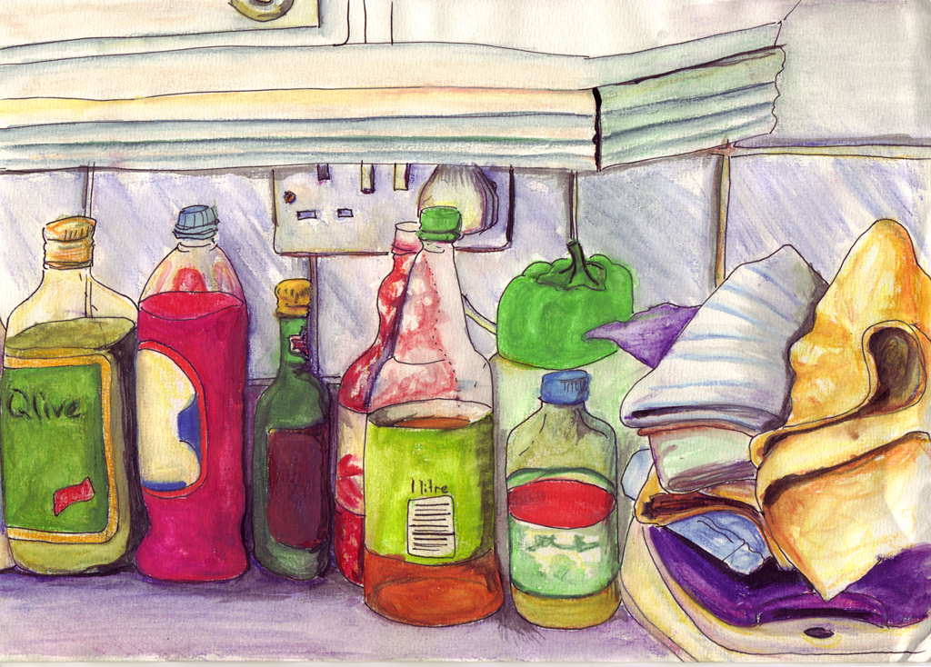
Sauce and drinks

I found this old piece which I thought I’d share. It was created before I started my MA when I was experimenting with water colours.

Sauce and drink bottles have such great colours and evoke all sorts of flavours and memories. This was painted in a Tooting Bec share house.

I naively applied heavy amounts of colour to this piece and had to be super careful when applying the water but I love the rich colours it produced. Illustrator Amie Howarth deliberately uses heavy amounts of colour to create her rich beautiful illustrations.

Finding this made me want to paint some more water colours.

New web site

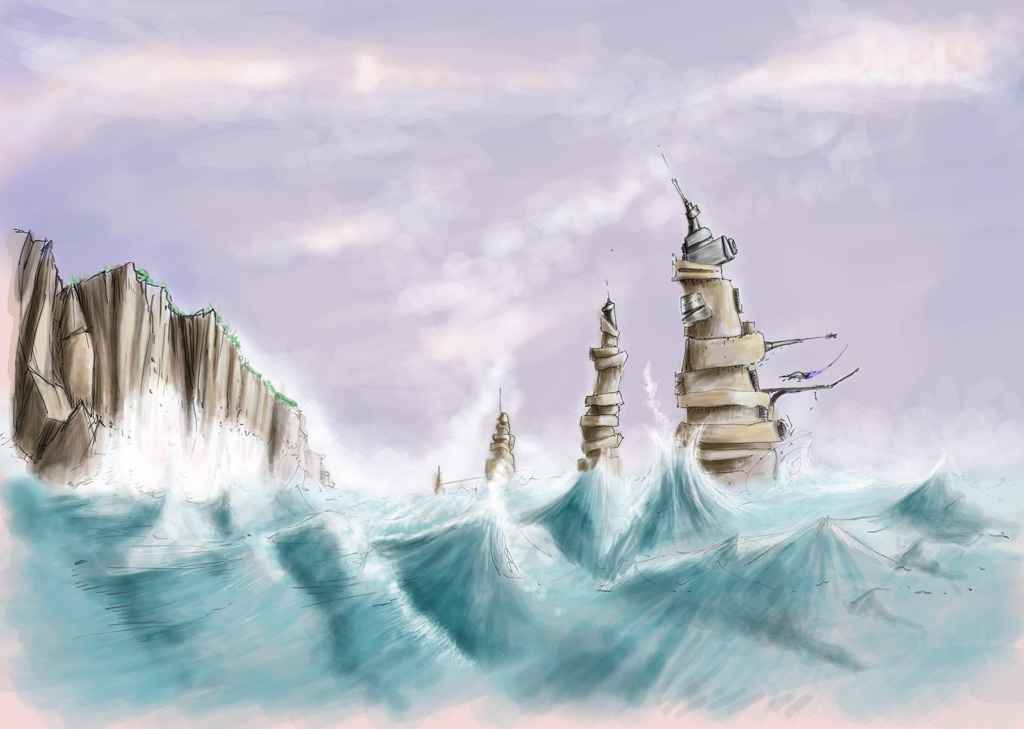
Coastal in progress

This work in progress is an example of a personal project I’m currently working and also something to illustrate the start new blog for my new website.

Coastal is one of a number of science fiction inspired paintings I’ve been working on over the last year.

WordPress and web development

I’ve built this site using WordPress.org to manage the content and a modified version of the Portfoliopress theme to get it looking and working the way I wanted. I’m developing my own completely customised WordPress theme but to get the sight running I opted for a WordPresses free community theme’s.

Not perhaps something you might normally expect of an illustrator but since I’ve been working with the web for decades it was only natural to want to build it myself.

Using WordPress as the underlying platform means that it’s easy to amend or add any or all of the content without touching a single piece of code from anywhere I can get a mobile broadband connection.

Tantrums and Tiaras

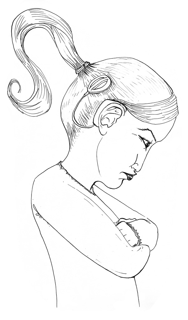
tiara-bw-fin

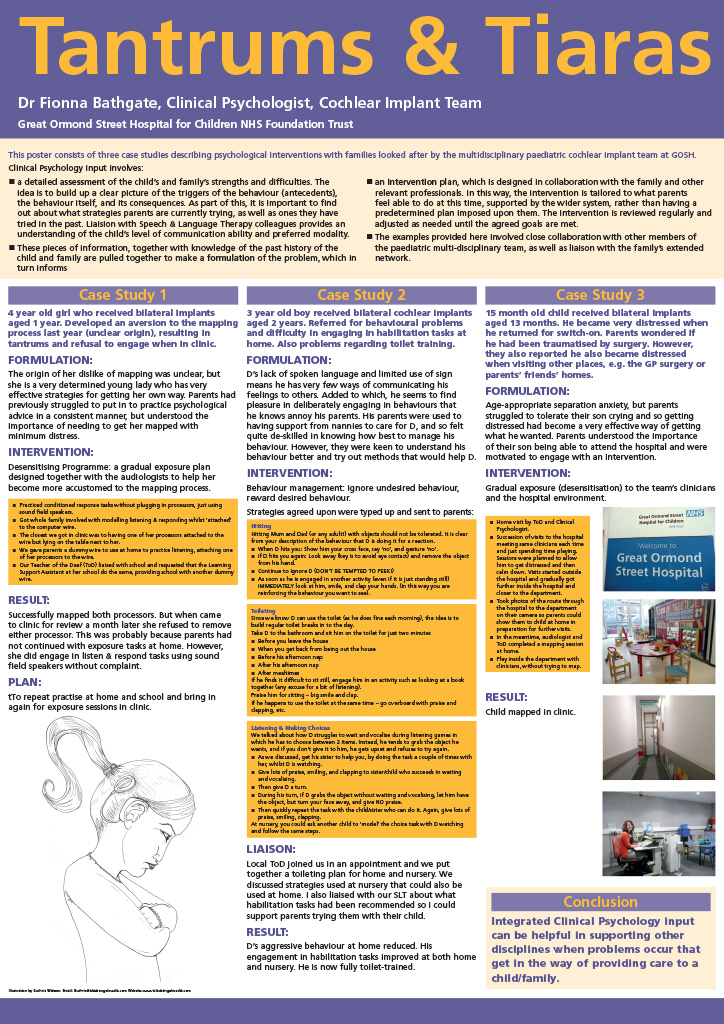
When my partner said she would need to try and find some free images to use with her conference poster I offered to draw an illustration.

‘Tantrums and Tiaras’ sounded like a great title to create images for and so I went ahead made some sketches that ended up as this spot illustration.

The poster was A2 which is why the text might seem a little small when looking at it here.

A0 poster

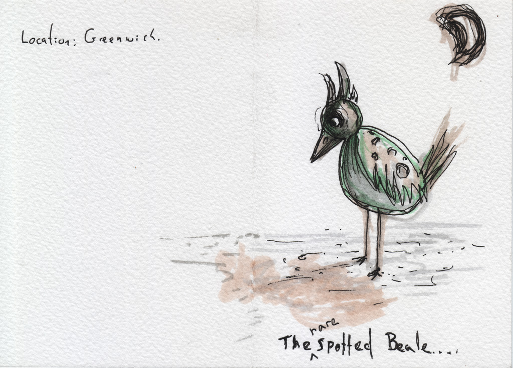
Joe’s card

Joe's card

I don’t make many birthday cards so it was ironic than when told not to I went ahead and made this one. I think I just had an idea and had to make it, I think creative people are often contrary like this.

Regardless I think Joe liked the illustration and I was happy with the end result and thought I’d share it on the blog.

Despite not doing them very often making a good one can be quite satisfying. For Joe’s I’ve aped his illustration style, passion and subject matter. I often take too long to make work so turning out this card in a matter of hours was enjoyable.